When considering the artists whose work influenced me the most
in the early days of my creative development, Chris Foss shines bright. Named
the “dean of science fiction illustration,” his work became one of the
dominating styles of book jacket illustration in the 1970s and later, and
remains one of the great franchises of the genre.
I can’t remember my first exposure to his work, but I knew
the name and the style when Science
Fiction Monthly began in 1974. It may have been his cover for E. E. ‘Doc’
Smith’s Galactic Patrol, which was
the first golden-era SF novel I bought and read for its own sake – I remember
the newsagent where I used to stare of those fabulous Panther editions, and the
cover price was 95c – the year must have been around 1973. I still have it,
indeed I’m looking at all the Panther/Grenada ‘Doc’ Smith volumes as I write
this. I used to study the painting under a magnifying glass, puzzling endlessly
over how Foss “managed to paint out of focus.” This was of course airbrush art,
but I had only vaguely heard the term, and it would be six more years before I
bought one.
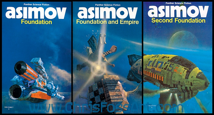
Foss, born in Guernsey, the Channel Islands, in1946, brought
to science fiction illustration more than imagination, he brought a grounding
in architecture from Cambridge, naturally flowing into technical illustration –
much as the American great Syd Mead brought sound technical knowledge to his
concept work for US Steel and later movie applications. Foss’s work is
characterised by a number of cardinal qualities – such as asymmetry, an
artistic rebellion against the symmetrical design often necessitated by “form
following function,” but sometimes by mere human preference: Foss’s work
proposes that this need not always be so, either by choice, or by form-to-achieve
function proceeding from laws of physics with which we are not yet conversant.
This alone offers a wildly futuristic implication, so that when viewing a Foss
painting one is imbued with a very convincing feeling of looking into another
time and place.
It is also a future embodied in dynamism, brilliant colour
and a minute attention to mechanical detail. It was said (by the venerable
Brian Aldiss in his introduction to Science
Fiction Art, Hart Davis MacGibbon, London, 1976) that the machine dominates
in Foss’s art, and that any human being which may be glimpsed is invariably a
tiny figure, hurried and occupied with his concerns, all of which are
subservient to the technical grandeur of the machines of his creation. “When
you catch sight of a human being in one of his paintings, he is a tiny, soft
creature, generally in overalls, vulnerable, hurried, among the abrasive
landscapes of a technological tomorrow.” (This may be ironically counterpointed
with his black and white interior art for The
Joy of Sex…)


During my younger days Foss represented the summit of the
pyramid. I was well aware of the output of many other excellent artists, such as
David Hardy, Eddie Jones, Kelly Freas (who also has been called the dean of SF
art!) and others, but as a devotee of the machine in science fiction, Foss’s
worlds captured my imagination like no other. His strange, almost organic
machines, defying the laws of aerodynamics at every turn, implying as they do
the unquestioned control of gravity, seemed to represent the ultimate ideal of
the human triumph, embodied in the conquest of space. But his work also
reflects the price at which these things come – his vessels belching pollution
in the form of thick, black engine efflux, titanic explosions as things go very
wrong, wrecked spacecraft marooned on exotic worlds, craft in collision, robots
the size of mountains treading the natural world beneath their city-block sized
feet – and humans minute as insects amongst it all, if they are glimpsed at
all.
It was heady stuff for a kid, and I have to wonder to what
extent these mega-machines helped shape my thinking. I have never forgotten the
feelings those paintings inspired, the exotic and the alien made tangible,
reachable, with the promise of technology overcoming the barriers of mundanity
to free humans to explore the universe. And of course, the mechanical minutia,
the intakes and exhausts, antennas and lights, every structural support and
shock-absorber, represented with loving attention to detail and rendered with
the brilliance of a very fine artist indeed.

When I think of the artists who have brought science fiction
to visual life, Foss is invariably top of the list. I could rattle off dozens
of names, each of whom has something special to bring to the table, a
uniqueness of style or approach, visual tricks that stamp their work – but Foss
is king. Perhaps it is the impact of his studied airbrush work, counterpointing
traditional brushwork and the exquisite application of oils – a fineness of
technique I have never yet been able to fathom. (How does one paint a perfectly straight, hair-thin line in oils?) Maybe
it’s the outrageous vision, which marries artistic abstraction to hard machine
technology; perhaps it’s the expansiveness of scope, the wide open spaces of
the universe, made real. Whatever, “Foss-esque” has become a word in my
vocabulary (yes, I tried his sort of fine detail, his strange not-quite-English
lettering styles and plethora of antennae in watercolours as a kid), and there
are times I’m more than tempted to visualise story material through the eyes of
such imagination. After all, while one might never be able to afford to
commission concept art from the maestro, one can always imagine it!


Now 71, Chris Foss is still working. After more than a
thousand book covers, he has become his own industry, in a sense, not exactly
cornering his own market but certainly preserving his own niche, distinct from
the great many other brilliant artists in the field. There was a time when a Foss
painting on the cover was almost guaranteed to sell an otherwise indifferent
book, and art directors called for other artists to emulate him – which
justifiably rankles the artist as it cost him work. The first major collection
of his art, 21st Century Foss
from Dragon’s Dream (1978), is a hard-to-find classic now, and the binding was
less than flash when new – beautifully printed but the pages disengaged quickly
from the sort of perfect-binding adhesive in use. Hardware, from Titan Books is a 240-page all-colour opus dating
from 2011, and well worth adding to any connoisseur’s library.


Find Chris’s official website here.
What can I say? Foss helped shape my outlook on the
universe, and his imagery remains both an inspiration and a standard.
Cheers, Mike Adamson

